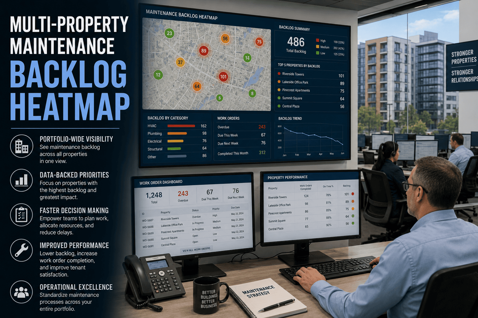
Every multi-property portfolio operations director runs into the same operational blind spot — the backlog is real, the work orders are open, the tenant complaints are stacking, the compliance inspections are coming, and there is no single view that shows where the worst pile-up lives, which property is degrading fastest, and which priority class is bleeding budget. A 22-story Class A office building in Chicago carried 847 open work orders for nine months before anyone could visualize the pattern, and the property manager tracked them in a spreadsheet the entire time. Multi-property teams running structured CMMS backlog management report 38 percent lower emergency repair costs, 52 percent faster tenant resolution, and 27 percent better vendor accountability — and the unlock is the heatmap that turns invisible backlog into a portfolio-level decision tool. Portfolio operations directors ready to install the visualization book a demo and walk through the heatmap on the worst-performing property first.
Property Management Backlog Visualization
Multi-Property Maintenance Backlog Heatmap
Visualize backlog by property and by priority in a single portfolio view. Allocate teams to the worst pile-ups first. Cut emergency cost by 38 percent and resolve tenant complaints 52 percent faster.
Backlog by Property and Priority
Critical
High
Medium
Low
Prop 01
42
68
35
12
Prop 02
8
22
29
15
Prop 03
31
54
47
21
Prop 04
4
11
26
9
847
Open work orders carried for nine months by a 22-story Chicago office building before visualization
38%
Reduction in emergency repair cost reported on multi-property CMMS backlog management programs
52%
Faster tenant request resolution on portfolio-wide CMMS with priority-driven backlog allocation
4.8x
Cost ratio of reactive break-fix repair events versus planned preventive maintenance work
What Is a Multi-Property Backlog Heatmap
A multi-property backlog heatmap is a single visualization that shows every open work order across the entire property portfolio organized by property on one axis and by priority class on the other. The cells light up in proportion to the volume of backlog at each intersection — so the property that carries 42 critical and 68 high-priority work orders shows up red and dark, while the well-managed property with 4 critical and 11 high shows up white and low.
The heatmap is the operating tool that converts portfolio backlog from a spreadsheet number into a decision aid. The director sees where to send the next contractor crew, which property to escalate to the regional manager, which priority class is bleeding budget, and which tenant complaints are about to escalate. Portfolio directors ready to install the visualization start a free trial and load the worst property to validate the model in 24 hours.
A 22-story office building can carry 847 open work orders for nine months before anyone notices the pattern — because the spreadsheet never made the pile-up visible.
What the Heatmap Surfaces That Spreadsheets Cannot
The heatmap reveals six operational insights that spreadsheet tracking buries. Each one is a portfolio-level decision the operations director can act on the moment the visualization loads.
01
Pile-Up Property Identification
The property in the dark red row carries the worst portfolio backlog. Reallocate crews and contractor capacity to that property first — the bleeding stops where the heat is concentrated.
02
Priority Class Bleeding
The dark vertical band shows which priority class is the system-wide problem. If high-priority is bleeding across most properties, the resourcing model needs a structural change, not site-by-site triage.
03
Compliance Risk Concentration
Open inspection-related backlog at the property level surfaces against compliance windows. Properties that fail the next inspection cycle are visible weeks before the inspector arrives.
04
Tenant Complaint Hot Zones
The property generating disproportionate tenant complaints lights up as a heat cluster. Renewal risk and reputation exposure surface in the heatmap weeks before they appear in lease renegotiation.
05
Vendor Performance Visualization
Filtered by assigned vendor, the heatmap reveals which contractors leave the longest backlog tails. Re-procurement decisions and SLA enforcement run against evidence rather than gut feel.
06
CapEx Forecast Triggers
Persistent backlog clusters on a single asset class across multiple properties signal a portfolio-wide capital refresh need. The CapEx forecast picks up the trigger from the heatmap automatically.
Six decisions a spreadsheet cannot produce, every one of them visible the moment the heatmap renders. Operations directors ready to load the visualization book a demo and walk through the heatmap on a real portfolio.
Why Spreadsheet Backlog Tracking Fails at Portfolio Scale
Spreadsheet backlog tracking persists across most multi-property operations because it works at single-building scale. It fails at portfolio scale for six structural reasons.
No Cross-Property Comparison View
Each property has its own tab, its own format, and its own update cadence. The portfolio director cannot compare Property 01 to Property 04 without manual consolidation that takes a full week.
Priority Class Buried in Filter Columns
Critical and high backlog sits next to medium and low in the same flat list. The eye does not catch the priority pile-up that the heatmap shows in two seconds.
Update Cadence Lag
The master spreadsheet was last refreshed three weeks ago. The director is making allocation decisions on data that has aged out — and the heat moved sites while the spreadsheet sat still.
No Vendor Filter for Performance Slice
Vendor accountability lives in invoice review, not in backlog allocation. The heatmap that filters by vendor exposes which contractor leaves portfolio-wide backlog tails — the spreadsheet cannot do that.
Compliance Window Lost in the Noise
Fire safety, elevator, backflow, and building code inspections each consume 15 to 25 staff hours per property per cycle. Without a heatmap that surfaces compliance-tagged backlog, the prep work happens in panic mode.
Reactive Cost Stays Hidden
Reactive break-fix costs 4.8 times more per event than planned work. The spreadsheet does not surface the reactive ratio at the property level, so the cost differential never enters the budgeting conversation.
Every one of these is removable when the backlog visualization runs against the portfolio asset registry on one CMMS — and the operations directors ready to remove them start a free trial on the worst-performing property first.
Reactive break-fix work costs 4.8 times more per event than planned maintenance — and the heatmap is the first place the reactive cost ratio shows up at the portfolio level.
How OxMaint Builds the Multi-Property Backlog Heatmap
OxMaint runs the heatmap against the live portfolio backlog. Every property, every priority class, every vendor, every compliance tag, and every asset class filters into the visualization in real time. The operations director uses one view to make weekly allocation, escalation, and budget decisions across the entire portfolio.
01
Portfolio-Wide Backlog Aggregation
Every open work order across every property aggregates into one live view with property and priority as the matrix axes.
02
Priority-Driven Heat Coloring
Cells color in proportion to backlog volume. The eye locates the worst pile-up the second the visualization renders.
03
Vendor and Asset Class Filters
Slice the heatmap by assigned vendor, by asset class, by compliance tag, or by tenant impact. Every filter renders against the same live data.
04
Drill-Down to Work Order Detail
Click any cell to drop into the work order list behind the heat. Assign, reassign, escalate, and close work orders without leaving the view.
05
Trend Mode and Time Window
Compare this week's heatmap to last month's. Properties moving from red to white prove the allocation strategy is working.
06
Executive and Regional Roll-Up
Heatmap rolls up to the regional and executive view with one click. Owner reporting and portfolio review run on the same visualization.
For portfolio directors managing multi-property operations in the USA under varied state and federal compliance, in Canada across provincial property codes, in the UK under the Building Safety Act and HSE, in the UAE under Vision 2030 real estate modernization, in Australia under high-tenant-expectation markets, or in Germany under BetrSichV — the heatmap model is the same and the operating decisions travel across the portfolio. Book a demo and load the worst-performing property to see the visualization in production.
Spreadsheet Backlog Versus CMMS Heatmap Backlog
The gap between spreadsheet tracking and CMMS heatmap visualization shows up in the same eight places every portfolio. The table below maps the operational difference.
| Backlog Discipline | Spreadsheet Tracking | CMMS Heatmap Operation |
|---|
| Portfolio aggregation | One tab per property, manual roll-up takes a full week | Live portfolio aggregation in one view |
| Priority visibility | Buried in filter columns, no visual pile-up cue | Color-coded heat by priority on one axis |
| Vendor accountability | Lives in invoice review, not allocation decisions | Vendor filter exposes contractor backlog tails |
| Compliance window tracking | Lost in noise, prep work runs in panic mode | Compliance-tagged backlog surfaces weeks early |
| Update cadence | Three-week stale data driving real-time decisions | Live refresh as work orders open and close |
| Trend comparison | Comparing two versions of the spreadsheet manually | Trend mode renders this week against last month |
| Executive reporting | Built fresh each month from consolidation work | Same visualization rolls up to executive view |
| Decision speed | Pattern visible after the crisis, not before | Pile-up visible the moment the heatmap loads |
Portfolio directors moving the backlog program from the left column to the right start a free trial and walk through the heatmap on their own portfolio.
ROI and Performance Outcomes Reported on Heatmap-Driven Backlog Programs
These are the outcomes property management directors report after a full year on CMMS-driven heatmap visualization. Variance comes from portfolio size and starting condition, but direction is consistent across commercial, multi-family, and mixed-use property operations.
38%
Lower emergency repair costs reported by organizations using structured multi-property CMMS
52%
Faster tenant request resolution with priority-driven backlog allocation across the portfolio
27%
Improvement in vendor accountability through digital work verification and SLA tracking
4.8x
Cost ratio of reactive break-fix events versus planned preventive maintenance work
15-25 hr
Staff time per property per inspection cycle recoverable with continuous compliance tracking
5 mo
Typical payback period on multi-property CMMS investment for mid-size portfolios
Portfolio operations directors stacking these returns across multi-property portfolios book a demo and use first-year results to fund the wider rollout.
Frequently Asked Questions on Multi-Property Backlog Heatmap
How quickly does the heatmap load against an existing CMMS backlog
The heatmap renders against the live backlog the moment the portfolio is loaded into OxMaint. Existing CMMS or spreadsheet backlogs can migrate during onboarding, and most property management teams are fully operational within 1 to 2 weeks. The visualization works from the first day of go-live with whatever backlog has been imported.
Can the heatmap filter by vendor, asset class, or compliance tag
Yes. Every filter renders against the same live data. Vendor filter shows which contractors leave portfolio-wide backlog tails, asset class filter shows whether the heat concentrates on HVAC, elevators, or building envelope work, and compliance tag filter surfaces inspection-related backlog before the next regulatory window. Filters combine for portfolio-level investigation.
Does the heatmap roll up to executive and owner reporting
Yes. The same heatmap rolls up to regional, executive, and owner views with one click. Property management directors run weekly operational meetings on the live visualization, regional directors run monthly portfolio reviews, and owner reporting renders against the same data without manual report-building.
How long does multi-property CMMS onboarding take
Most property management teams complete onboarding in 1 to 2 weeks. The process covers asset upload, PM schedule configuration, technician and vendor account setup, tenant portal activation, and existing backlog migration. The implementation team provides guided setup, and the mobile app requires no formal training — most field technicians complete and close work orders within their first shift.
From Invisible Pile-Up to Visible Decision
Turn Multi-Property Backlog Into a Portfolio-Level Decision Tool
Spreadsheet tracking buries the pile-up. The OxMaint multi-property heatmap surfaces it the moment the visualization loads — and portfolio directors run weekly allocation, escalation, and budget decisions on one live view. The result is 38 percent lower emergency repair costs, 52 percent faster tenant resolution, and 27 percent better vendor accountability across the entire portfolio.
Live portfolio aggregation with property-by-priority heat coloring
Vendor, asset class, compliance, and trend filters in one view
Executive roll-up and owner reporting on the same visualization
Live in days, not months
Onboard in 1 to 2 weeks
Works across 5 to 200 properties
Same visualization for ops, regional, executive